How can GIS help in this kind of public health issues?
The coronavirus disease outbreak
The recent days everyone has seen and heard the spread of a new virus called coronavirus. According to the World Health Organization (WHO), coronaviruses (CoV) are a large family of viruses that cause illness ranging from the common cold to more severe diseases such as Middle East Respiratory Syndrome (MERS-CoV) and Severe Acute Respiratory Syndrome (SARS-CoV). A novel coronavirus (nCoV) is a new strain that has not been previously identified in humans.
Common signs of infection include respiratory symptoms, fever, cough, shortness of breath and breathing difficulties. In more severe cases, infection can cause pneumonia, severe acute respiratory syndrome, kidney failure and even death. Standard recommendations to prevent infection spread include regular hand washing, covering mouth and nose when coughing and sneezing, thoroughly cooking meat and eggs. Avoid close contact with anyone showing symptoms of respiratory illness such as coughing and sneezing.
The disease as a geospatial puzzle
Having the disease spread across all continents and dozens of countries in such little time, immediately a geospatial question rise. Can we find a pattern or relation using geospatial data?
For the record, the spread of the virus is extremely complex and multi-parameter. People are being infected by other people who are already infected by touching a surface or object that has the virus on it and then touching your own mouth, nose, or possibly your eyes. The interaction and travelling of people is what actually enables the virus to spread so quickly.
The data used in the study
In order to make this study the following data were used:
- Airport locations from the datahub.io
- Novel Coronavirus (COVID-19) Cases, provided by JHU CSSE
The first dataset includes all airports around the globe with their coordinates in WGS84 and their categorization. A total of 55585 airports are present in the dataset. To make our study a bit easier and tackle the fact that most of the COVID-19 data are reported in country level, we filter the airport dataset and select on the large airports (614 in total).

Sample data from the airport dataset
The Novel Coronavirus (COVID-19) Cases is the data repository for the 2019 Novel Coronavirus Visual Dashboard operated by the Johns Hopkins University Center for Systems Science and Engineering (JHU CSSE). Also, Supported by ESRI Living Atlas Team and the Johns Hopkins University Applied Physics Lab (JHU APL).
For each day the total number of confirmed cases, deaths and recoveries are recorded together with their location (WGS84 coordinates). These coordinates refer to the corresponding countries central location or in some cases (like China), the province central location. This kind of spatial aggregation makes sense, since it’s very hard to record the specific location for each case.

Sample data from the COVID-19 dataset
Geospatial Analysis
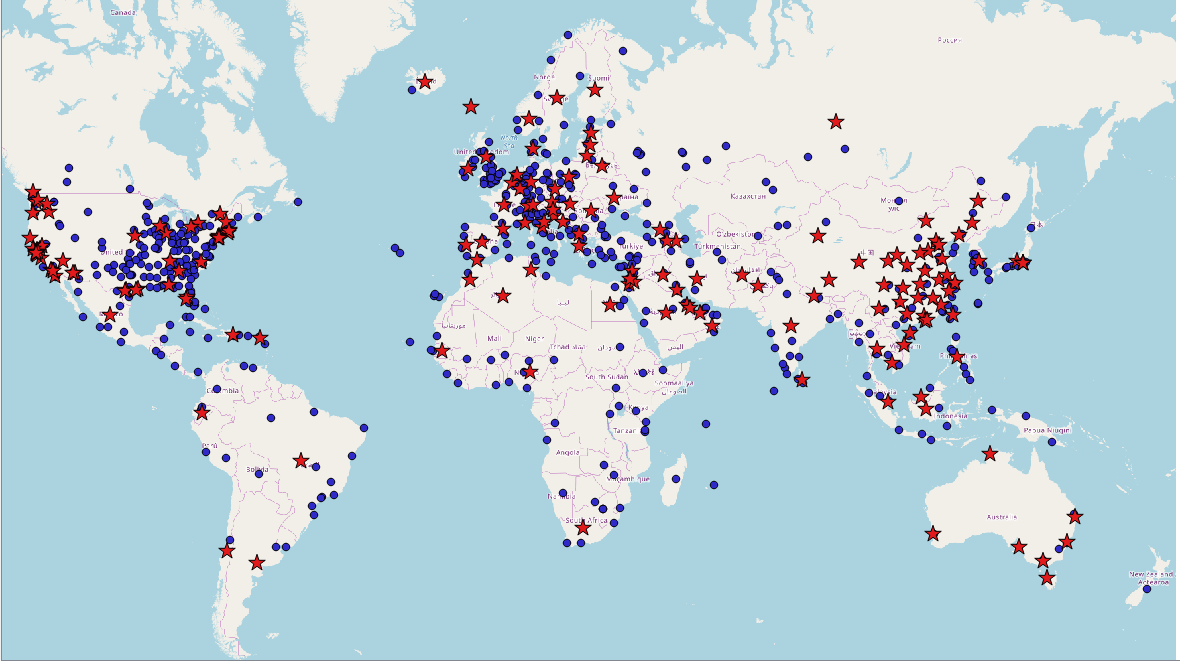
Now let’s get to the core of our geospatial analysis. From the figure below it is immediate to see that there is are relation between airport locations and COVID-19 locations.

All the airports locations and COVID-19 locations
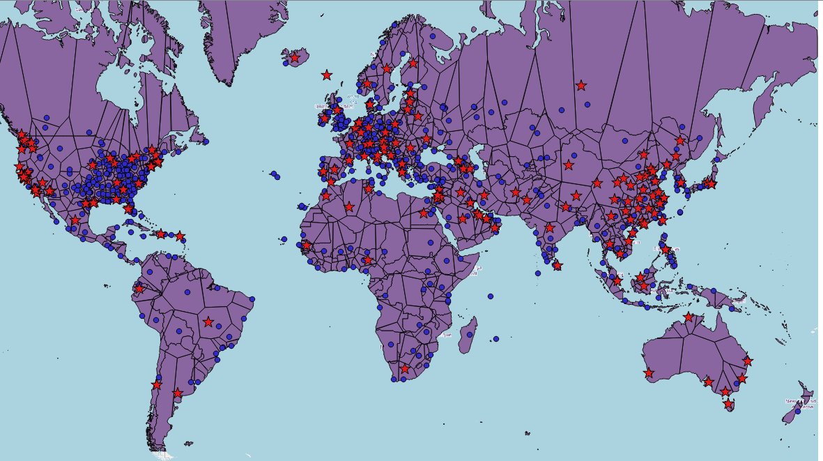
To better visualize this spatial correlation, let’s focus only on the large airports.
All the large airports locations and COVID-19 locations
Thiessen Polygons
Thiessen polygons are generated from a set of sample points (in our case the large airports) such that each polygon defines an area of influence around its sample point, so that any location inside the polygon is closer to that point than any of the other sample points. Thiessen polygons are also called voronoi diagrams. Thiessen polygons are used to allocate space to the nearest point feature. It defines an area around a point, where every location is nearer to this point than to all the others. Let’s see how it look like on our map (our thiessen polygons are intersected with the countries boundaries in order visualize only the land part of our dataset).
Large airport locations, thiessen polygons of large airports and COVID-19 locations
Now that we have the “zones of coverage” for each large airport, let’s correlate them (join by location in QGIS) with the COVID-19 locations. For each thiessen polygon we find the COVID-19 locations that are inside them. Then we sum the number of confirmed cases for each polygon and visualize them in a white to red scale.
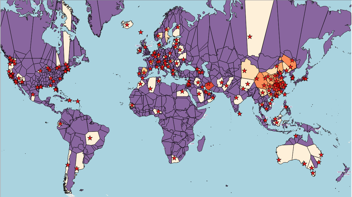
Thiessen polygons “infected” with COVID-19
To tackle the COVID-19 location aggregation issue we group our data in country level.

It seems that 112 out of 252 countries have confirmed COVID-19 cases, all have at least one large international airport. Only 12 countries do not have a large airport. Of course, not all transportation is made through airports, but also through ports and roads. Having detailed geospatial data that capture the connections among cities, towns and villages can help to show case how a virus can spread across continents and at what speed. This a much more complex problem, but the same geospatial principles are present.